People see your content or ads but fail to take action or engage further. We know the pain you’re facing — and we can help you get through it. The solution? Write better CTAs.
Without a clear and compelling call-to-action, potential customers may not know what you want them to do next or why they should care.
According to one study, including an obvious personalized CTA button can increase conversion rates by over 200%.
That’s why having a strong call to action (CTA) is crucial. Your CTA is one of the most effective ways to grab your visitors’ attention, inspire them to engage, and convert them into leads and sales.
This comprehensive guide will teach you everything you must know about creating compelling CTA. By the end, you’ll have all the know-how, tips, and examples to craft the perfect CTA for your brand every time. Let’s dive in!
In This Article
What is a Call to Action?
A call to action (CTA) is either text, a button, or some kind of graphic that prompts users to take a desired action.
You use it in your marketing campaigns and on pages of your website, landing pages, cart pages, checkouts, and more to guide visitors on what you want them to do next.
Some call to action icons/buttons you’ll commonly come across are:
- “Sign up!”
- “Purchase now”
- “Download our free guide”
- “Add to cart”
- “Register here”
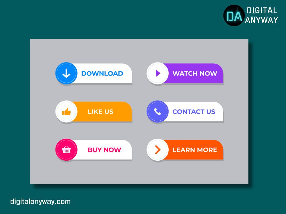
Your CTA should be a natural next step for visitors after engaging with your content or offer, like following up on an offer meant to capture leads in your funnel.
Why are CTAs Important?
Consider these two scenarios where a visitor is browsing products on your e-commerce website:
Scenario A:
The visitor stumbles across a product page for a backpack they love. But after reading all about it, there is no visible call to action to purchase the backpack. So the visitor finds themselves wandering around, not knowing how to buy the item, and eventually leave.
Scenario B:
The visitor finds the same great backpack product page. At the bottom is a colorful “Add to Cart” CTA button. What the visitor can do to purchase the backpack is obvious.
CTAs are critical components on landing pages, sales pages, and throughout your website because they convert your engaged visitors into what you want them to become — customers, subscribers, leads, or donors!
Without a CTA, visitors will simply browse around without taking your desired action. There is nothing to inspire them to do so. But if you present them with prominent, compelling call to action icons, it increases the chances that they will click.
Key Elements of an Effective CTA
Not all CTAs are equal. Some internet content gets much attention and engagement, while others struggle to get almost any response. But what makes some call to action icons so much more clickable? Generally, highly effective CTAs include these four key elements:
1. Action-Oriented Language
Do you know that customers share purchases on social media 16 times more often when post-purchase pages include a CTA?
Since your CTA’s purpose is to prompt visitors to act, your phrasing must be clear and actionable.
Your copy should answer what action you would like visitors to take. The wording needs to directly ask visitors to do what they want – sign up, register, apply, buy now, learn more, or download. So, the trick is always to use a verb in your CTAs to make it action-oriented.
Some examples, with action-word in bold, for your understanding:
- Start your free trial
- Shop all spring looks
- Download the app today
- Buy tickets
Some verbs you want to consider using in your call to action samples include:
- Try/Test
- Order
- Register
- Enrol
- Join
- Book
- Start
- Get/Download
Using an action verb creates a sense of urgency and purpose behind the CTA, inspiring more visitors to click on it.
2. Clear Benefit or Incentive
Do you ever look first for anyone other than yourself in a group photo? No, we’re conditioned to look for what’s beneficial to us. So, why should your visitors take action — what’s in it for them?
You need to articulate the incentive or benefit behind your CTA. Some call to action samples:
- Three free months of access
- 50% off for first-time users
- Get a special coupon code
- Access this exclusive content
- Be entered to win a prize
Offer something of value that motivates a user to hit that button. Show your visitors what’s waiting for them on the other side. Even just saying “Get your free trial” conveys the benefit clearly, which is a free trial here.
3. Sense of Urgency or Scarcity
Tap into basic human psychology by using limited-time language in your CTAs. When visitors think they must act fast, it compels them to take the desired action now instead of putting it off until later (or never).
Examples of urgency and scarcity tactics include:
- “Today only!”
- “Limited time offer”
- “Expires in the next XX hours”
- “Only X spots left!”
- “Sign up before it’s too late!”
These create the perception that they’ll miss out if they don’t click the CTA button immediately. Fear of missing out (FOMO) is a powerful motivator!
4. Consistency with the Offer and Landing Page
Ensure your CTA aligns with your overall offer (like an email opt-in or promotion) and the experience they’ll encounter next on your landing page. You don’t want to set wrong expectations.
For example, if your offer was for a free guidebook and someone clicks your CTA, they should land on a page where they can access and download it.
Your CTA should seamlessly flow into the next steps for the visitor’s expectations — don’t break that chain. Continuity drives higher conversions.
Creative Call to Action Samples/Examples
To get inspired for your own CTAs, check out these examples of great calls to action from brands big and small:
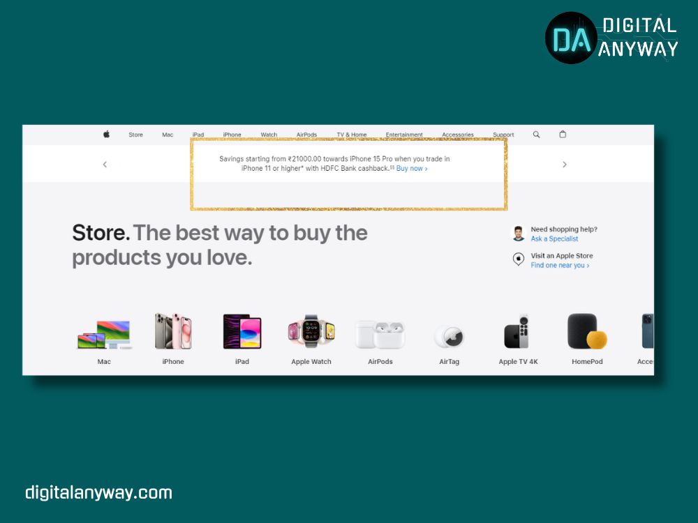
1. Apple
Apple offers instant discounts on credit card purchases, and students offer during certain months. It is a great way of calling attention to their potential customers.
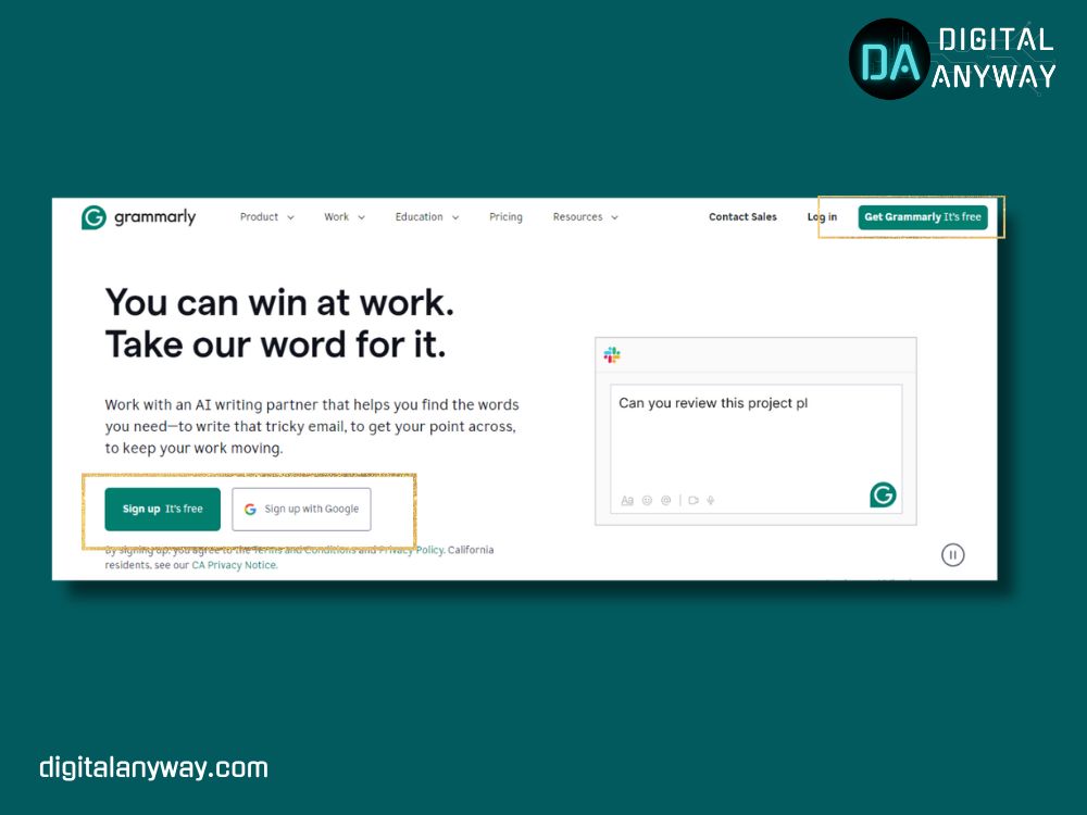
2. Grammarly
In one simple phrase, Grammarly communicates both what action to take (“Signup its free“) and the benefit (”Get Grammarly its free“). That is exactly what someone needs to motivate them to click and sign up.
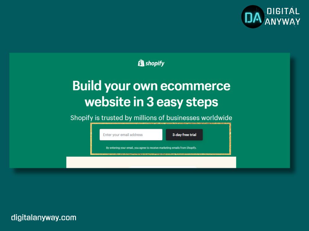
3. Shopify
Shopify highlights the action of getting started with their e-commerce platform for a 3-day free trial. This CTA would likely perform very well, given how enticing a free trial is for a soon-to-be e-commerce store owner.
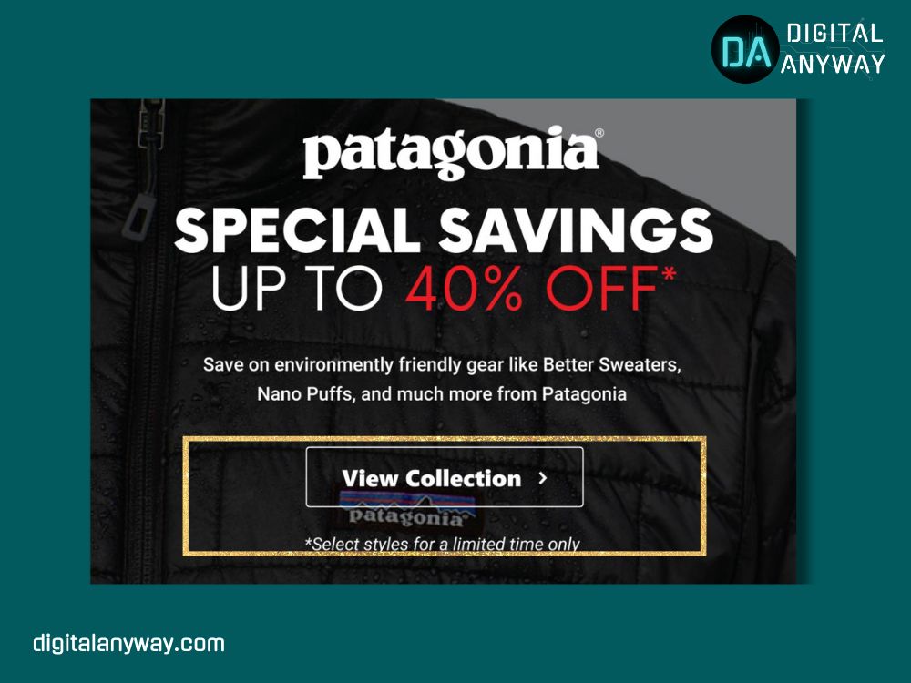
4. Patagonia
Outdoor apparel company Patagonia focuses more on storytelling and imagery but still works in a small CTA to further engage visitors. This is effective because their target customers are likely to click to learn more about environmentally friendly materials they love using.
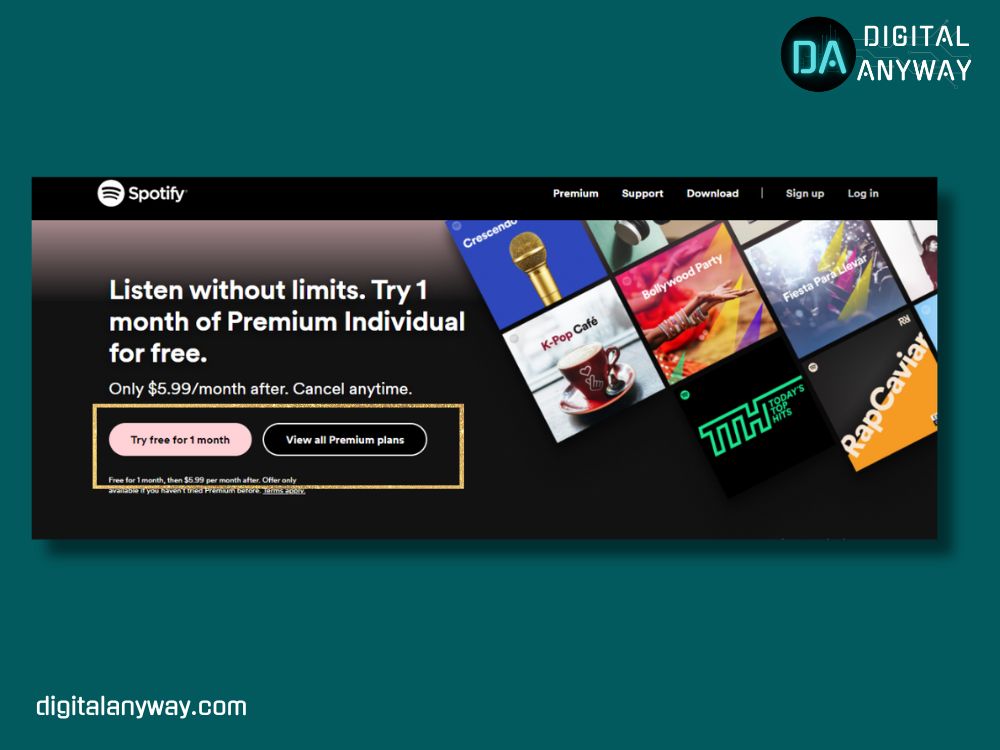
5. Spotify
For Spotify’s free trial, they combines an incentive with scarcity. Tempting someone with a discount and noting the short timeframe to capitalize inspires quick action.
6. Netflix
While technically not a CTA button, Netflix’s eye-catching text directs new users to “Get Started” by entering their email. This is a nice way to push newcomers to give their streaming service a shot.

How to Optimize Your Call to Action in Marketing
Don’t just set and forget your CTAs! To maximize their performance, you should continually test and optimize based on data. See what resonates most with your audience and your conversion goals over time.
A few techniques to optimize call to action marketing include:
1. A/B Test Your CTA Copy
Run A/B split tests on the phrasing of your CTA to see which wording drives more clicks and conversions. That’s because even small tweaks in your language can have a big impact!
For example, you could test these call to action samples:
- “Start your trial” vs. “Get your free trial.”
- “Download now” vs. “Download for free.”
- “Create my account” vs. “Sign up.”
2. Experiment with Visual Elements
Beyond copy, test visual attributes of your CTA buttons like:
- Color: Bright, contrasting colors typically perform better in grabbing the attention
- Size: Larger buttons seem more clickable
- Placement: Try different spots on the page
- Shape: Round edges’ unique shapes stand out more
As per CXL, the red call-to-action button dramatically outperformed the green variant, driving more conversions.
You may also use heat map tools like VWO, Microsoft Clarity, Crazy Egg, and Hotjar to reveal how visitors interact with your page and pinpoint where you should place CTAs.
3. Personalize CTAs with Smart Traffic Tools
Take personalization up a notch by serving tailored CTA variations to specific user segments likely to find that version most appealing. This level of personalization can lift conversions tremendously.
Tools leverage machine learning to determine the best match between the visitor and the CTA option.
4. Review Post-Click Behavior
See at what rate your CTA achieves its purpose. If you want lead gen sign-ups, analyze how many visitors actually complete the form after clicking your call to action icon.
A low follow-through rate after the initial click is a sign that your CTA or landing page experience needs reworking. Troubleshoot why visitors aren’t converting at the volume you
Call To Action Icon: FAQs
How do I increase the call to action on a website?
To increase the call to action on a website, focus on crafting compelling, benefit-driven language for your CTAs. Also, prominently position them where website visitors are most likely to notice and use them.
How long is a call to action on a website?
Your call to action on a website should be short – around 5 words or less. Conciseness helps ensure it is readable and scannable.
What do you mean by the call to action?
A call to action is an instruction to your audience designed to provoke an immediate response, like “Sign Up Now” or “Start Your Free Trial.”
How do you write a good CTA?
To write an effective CTA, clearly tell your audience what to do next while highlighting the key benefit they’ll receive, and use action-oriented language that conveys urgency.
Call To Action Icon: Conclusion
Crafting compelling calls to action in marketing is crucial for converting website visitors. Use action-oriented language and highlight clear benefits to motivate users. Test variations in phrasing, visuals, and placement to optimize performance.
Personalize your CTAs for higher relevancy. Review post-click behavior to improve follow-through rates. For any assistance boosting conversions with optimized CTAs or other digital marketing solutions, contact our experts at Trectoid.
